Case overview
Updated the Oregon Unemployment website to have a modern sleek and professional look.
The Brief
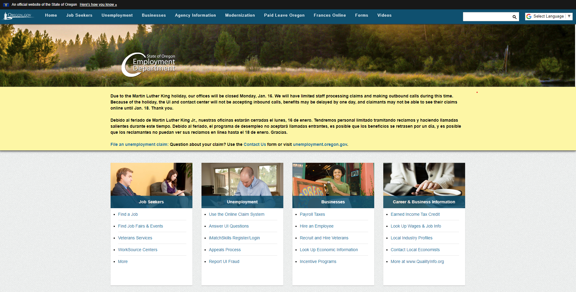
The Oregon State Unemployment site was outdated, hard to use, and in severe need of an update. My team took it upon ourselves to give it a modern, professional, and easy to access redesign that would help people in need access their financial aid or find employment for themselves.
The Testing
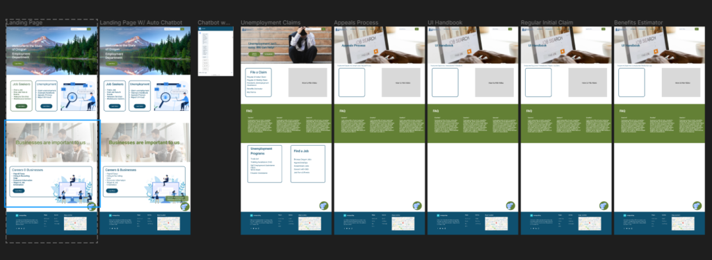
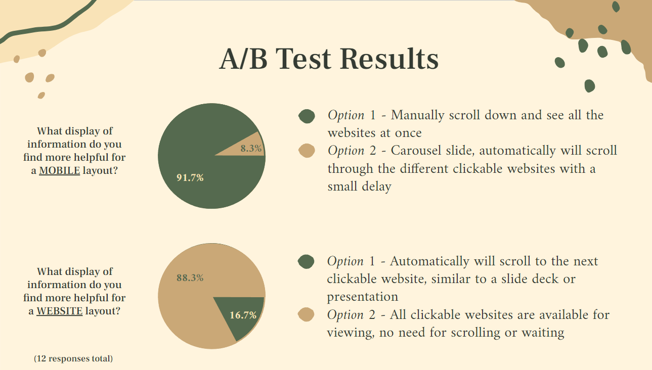
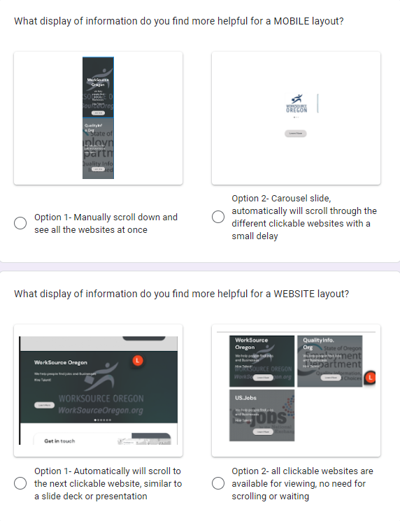
Through several iterations of wireframes, combined with extensive A/B testing we were able to come out with a new and improved version of the Oregon State Unemployment site. We employed several testing methods to try and find the most responsive and easy to use layout, and eventually settled on testing for a first click test to determine what users thought was most important on the page. Our metric of success was designing a page that users could click through and navigate to the unemployment screen within 3 clicks.
Our Approach
My team sought to declutter and increase the effectiveness of the website by removing the empty space and making the site easier to navigate.
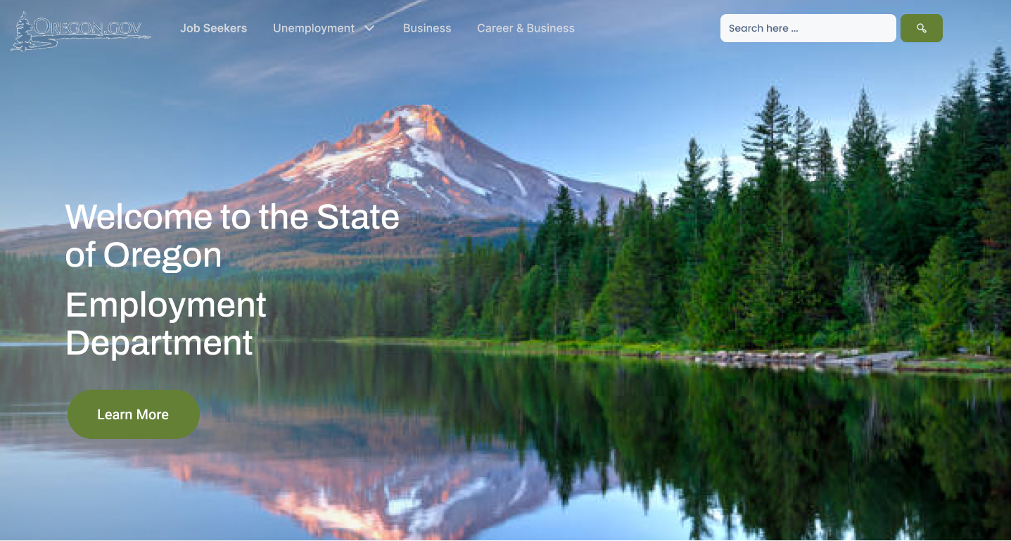
The Results
The resulting page had a much more modern and sleek look to it, being more effective in presentation of it’s information without the clutter of the popup message in yellow, and more clear and direct buttons and boxes for users to click.